May 22, 2006

Rogue Wave Poster

RogueWave_Poster(.50)

Here's a version of the poster that I may go with. If you have any suggestions, they are much appreciated!

Illustration Friday - Sorry

IF_Sorry

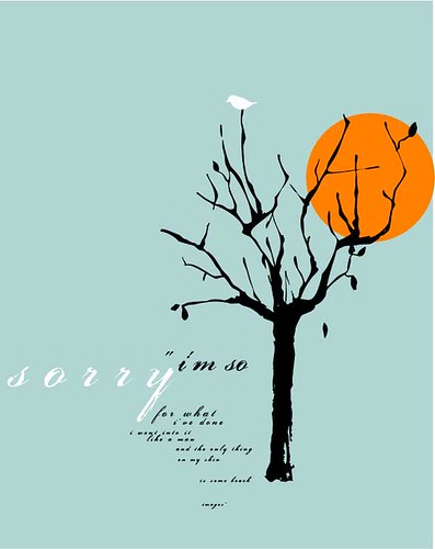
"i'm sorry for what i've done
i went into it like a man
and the only thing on my skin
is some beach blown images"

- rogue wave "salesman at the day of the parade"

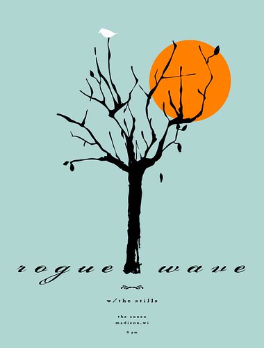
Here's my take on the topic "sorry"...I'm currently working on a poster for Rogue Wave who is going to play in Madison on 6/22. I really like the image, and like that passage from the song. So I figured, what the hell, I'll included the saying and image together. The bird, sitting on top of the tree, sorta represents someone hiding up high, sorrowful and apologetic.

I've added the concert poster to my main blog. Please visit and give any suggestions and/or criticism. Thanks!

May 15, 2006

Illustration Friday - Angels & Devils (part 2)

Angels_Devils-IF(2)

A second version of my original idea. I like this one the best. The first round is on my main blog. Again..mmmmmmmmm...cake....

May 14, 2006

May 10, 2006

Illustration Friday - Fat

Fat_IF

My take on this weeks topic. As you can guess, the image shows America's journey down the road of obesity. To each their own.

I have added another piece to my blog as well. Please feel free to visit my main blog, and to post any comments and/or critiques of the other piece. I intend to put the "Globalization" piece in my portfolio. Thanks for all of your comments and support!!!

Globalization

ShipContainer_Glblztn

This is a piece that I created based on a book review. The book is titled "The Box: How the Shipping Container Made the World Smaller and the World Economy Bigger". Please feel free to post any comments and/or critiques. I intend to add this piece to my portfolio.

May 1, 2006

Health Magazine - Spot Illustrations

2006BestOf_Spots

I found an article in Health Magazine rating the best snack, dinner and lunch items for 2006. On this project, I decided to go back to my watercolor roots and test my patience with them again. In the past, I didn't take the time to "work" the color. Well, I "worked it" this time, worked my patience and am very pleased with the outcome.

I'm sticking with using a bold line around the image. I liken it to melding the traditional with modern touches. The other pieces on this blog were created using colored pencil, ball point pen, and sharpie.

Please feel free to make comments, give out some tips, or constructive criticism.